Reimagining a Powerful B2B eCommerce Platform
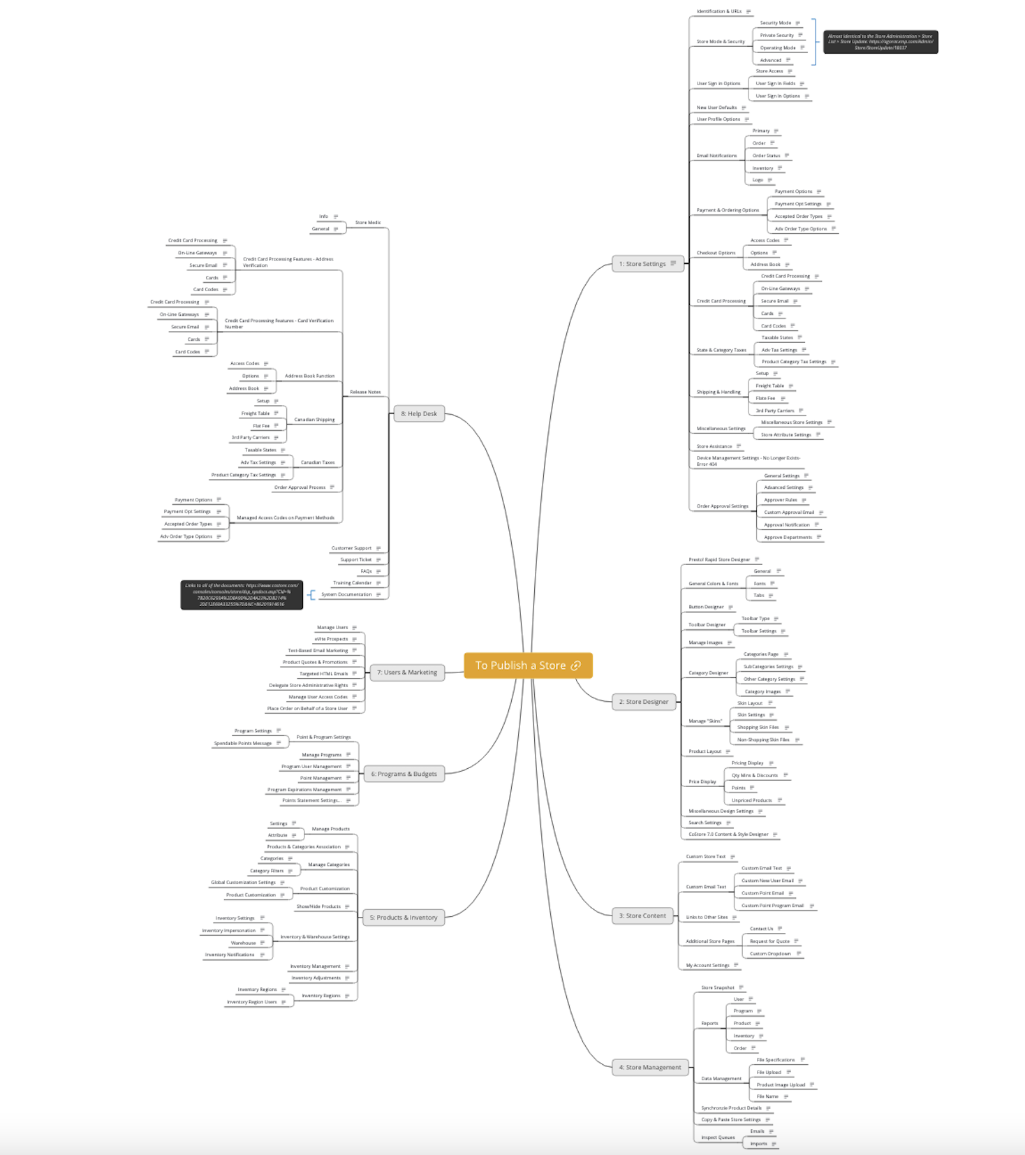
Corexpand was founded in 1998, quickly becoming one of the early leaders in the B2B e-commerce space, particularly in the promotional products industry. But by 2019, the company’s proprietary platform system was in dire need of modernization. The need to refresh Corexpand’s administrative console and front end sites provided the opportunity to audit the system’s feature sets, information architecture, and overall user experience. Over the course of three years, a small-scale team rebuilt the software from the ground up as the Agora commerce system—an integrated network of buyer and supplier platforms built on a SaaS model, offering a powerful array of e-commerce tools.
As the project’s sole UX designer, my role encompassed big-picture strategy and implementation of executive vision, the creation of an original design system, the design of over 1,700 individual high-fidelity mockups in Sketch, extensive prototyping, writing SRS documents, direct collaboration with front-end developers, and rigorous QA testing.
Problem Statement: Corexpand’s legacy software, though functional, is no longer competitive due to convoluted architecture, poorly integrated enhancements, and an outdated user interface.
Project Goal: The rebuilt and redesigned Agora system will serve buying organizations by optimizing purchasing processes, saving buyers time and money. Agora will serve Supplier organizations by providing access to new selling opportunities and buyer relationships.
Project Duration: 3 Years
Project Roles:
Director of Product Design: Paul Vermeesch
Director of Technology: Magesh Sreenivasan
Front-End Dev: Muhammad Osama, Jerzy Kurowski, Sadiq Chola
Executive Leadership: Lindsey Tanner, Kirk Joseph
Methodology and Process
Our redesign efforts had to happen on two fronts simultaneously. We needed to rebuild the administrative console (used by our clients) at the same time as the front-end sites (used by our clients’ customers). While this gave us the most opportunity to implement new ideas, it required efficiency, economy, and a careful triage of those new ideas. It also forced us to rely on our industry expertise, competitive audits, and the experience of our sales and support teams over user research when making design decisions. We conducted ideation and brainstorming sessions followed by design critique sessions when mockups were ready for review. After iteration and implementation, we continued refining our solutions based on real-world user feedback.
Information Architecture
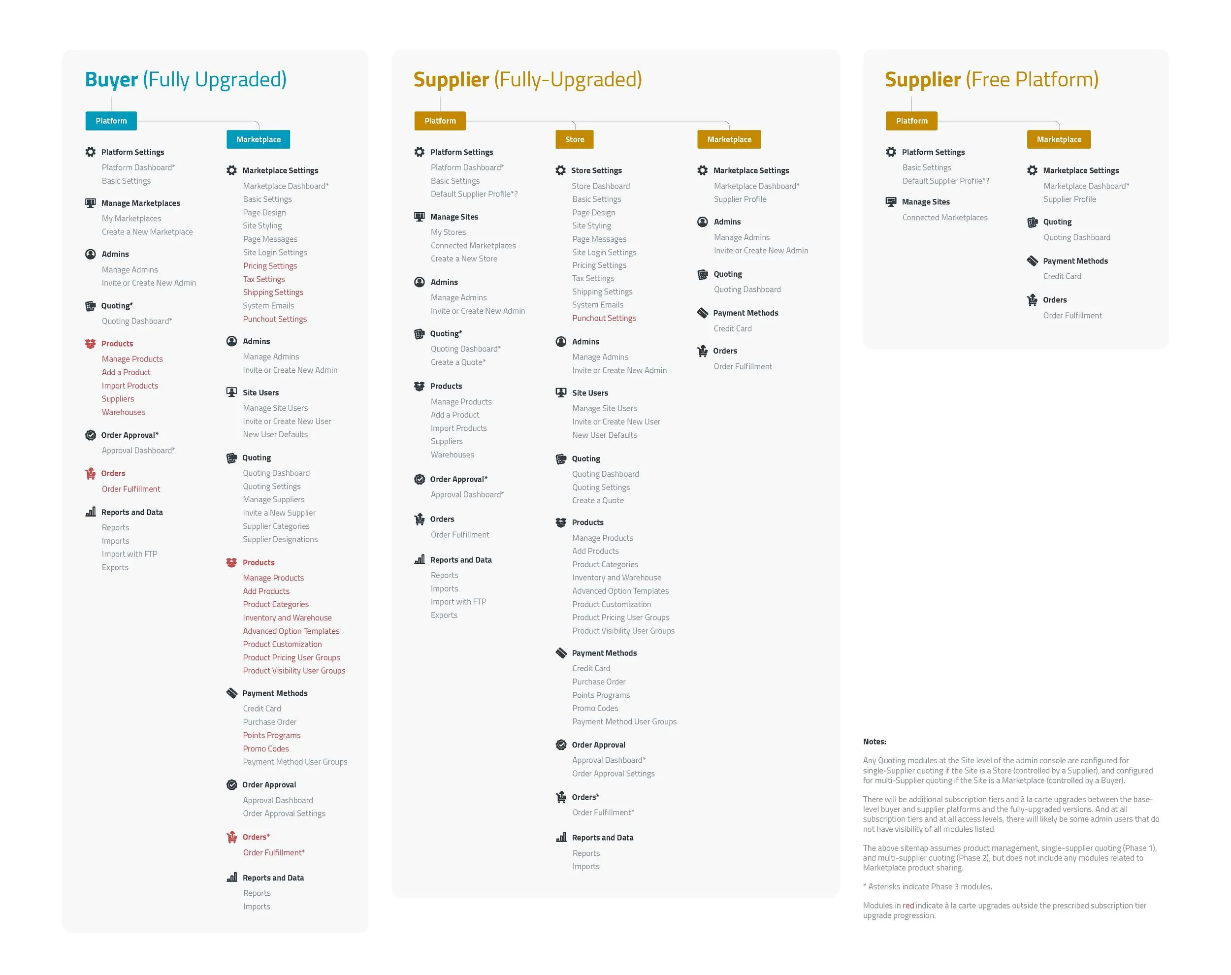
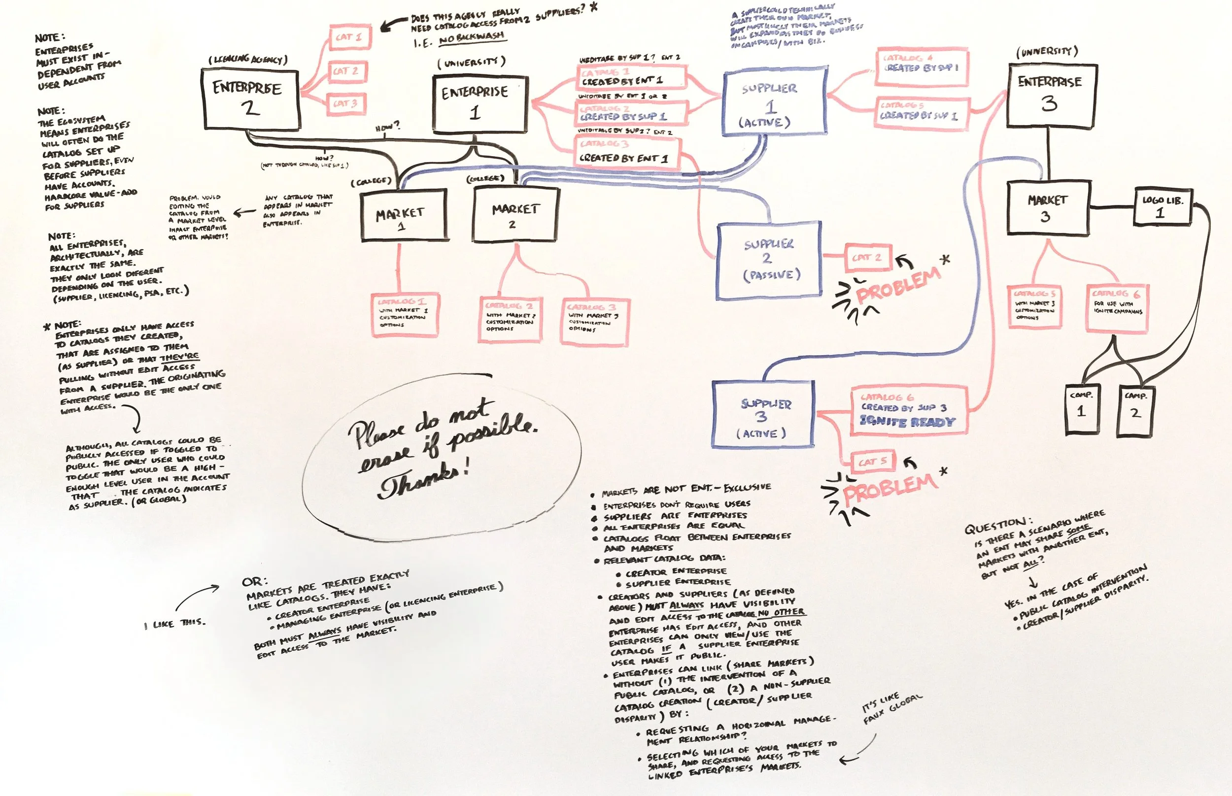
We began the process of creating the Agora administrative console by rethinking its information architecture. The legacy system used a two-level architecture that distinguished between platform-level and site-level administration. We wanted to preserve this structure, as it allowed for a single client to manage multiple sites within a single platform while maintaining centralized control and reporting, but we innovated on the architecture by creating two distinct platform types—one for buyers, and one for suppliers. We also created two kinds of sites. “Stores” would be managed by supplier platforms while “Marketplaces” would be managed by buyer platforms.
This bifurcated information architecture maximized our flexibility and created new ways for supplier and buyer platforms to interact within the system.
Agora Design System
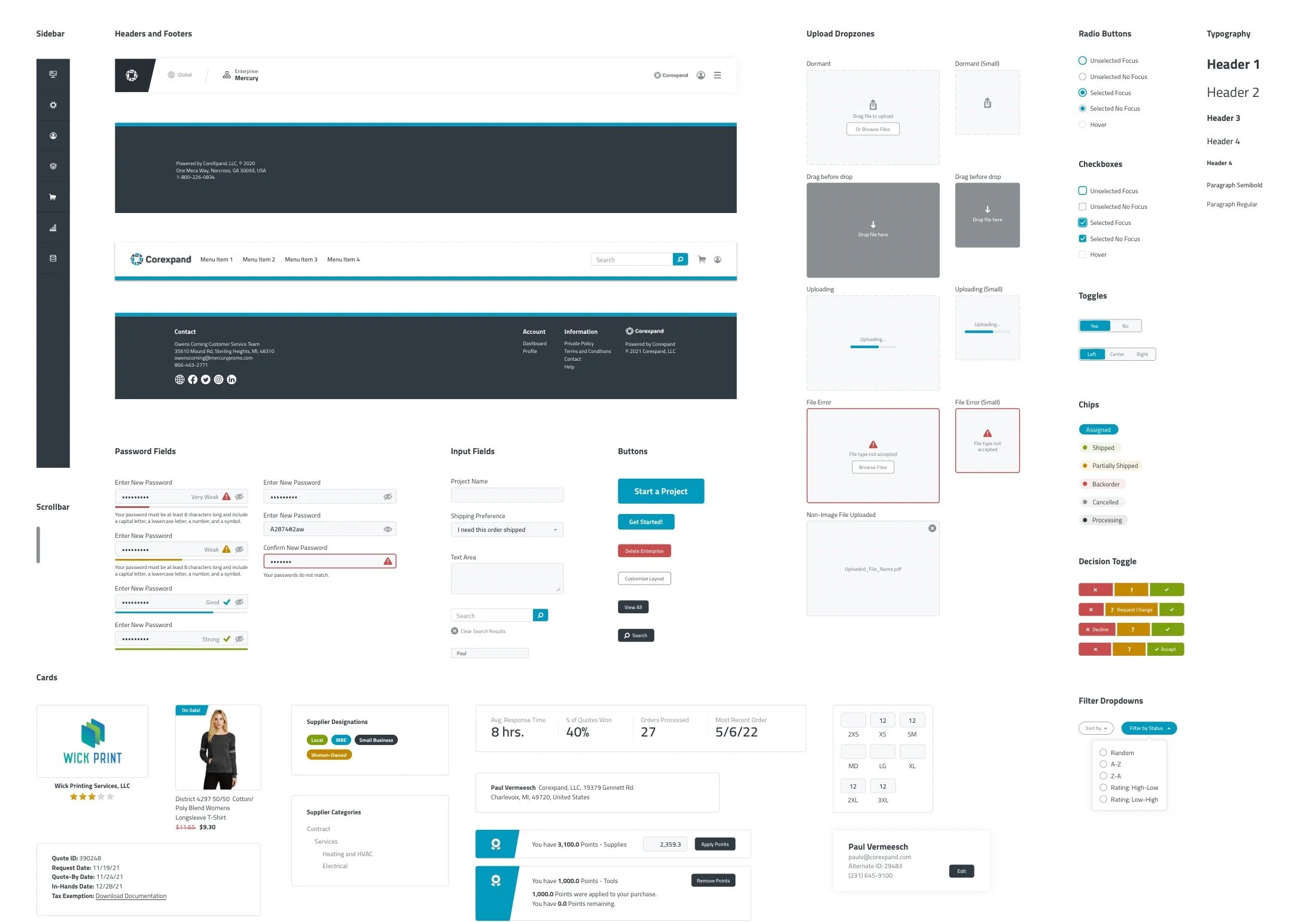
Rather than starting with an existing design system like Material, Polaris, or the Atlassian Design System, I chose to create my own design system from scratch. This approach allowed me to better infuse the design system with the Agora brand and build components for use cases specific to the Agora system. I also hand-illustrated all icons used in the Agora Design System and ensured that all components and interfaces met the WCAG 2.1 AA accessibility standards.
Mockups and Prototypes
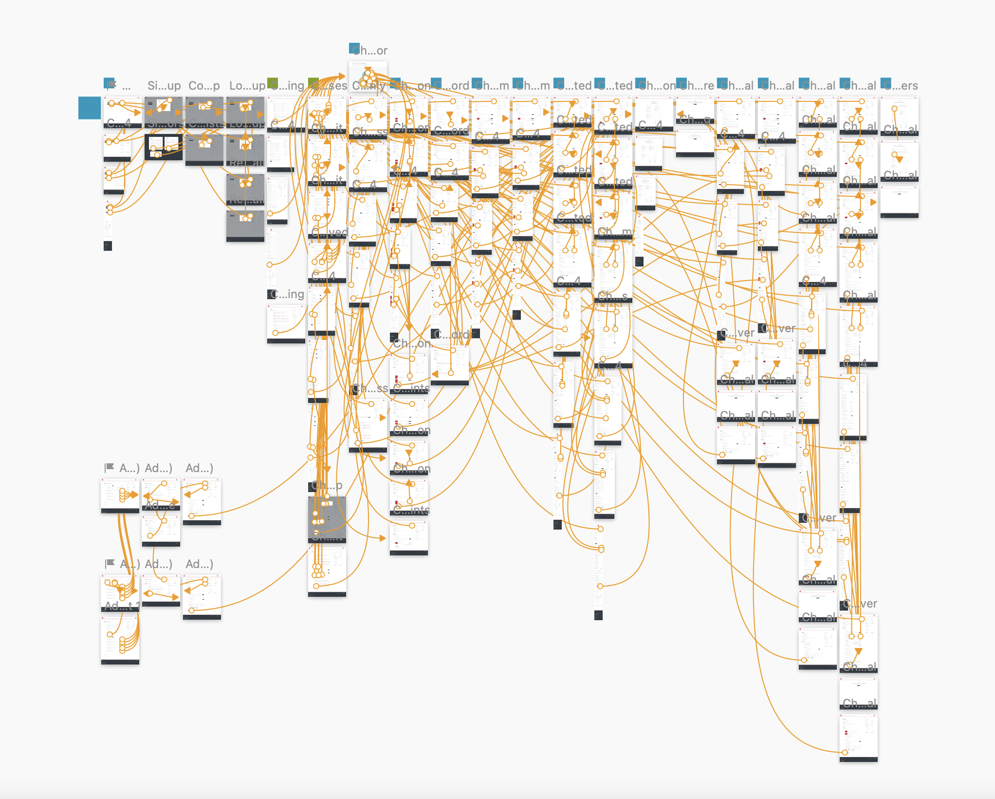
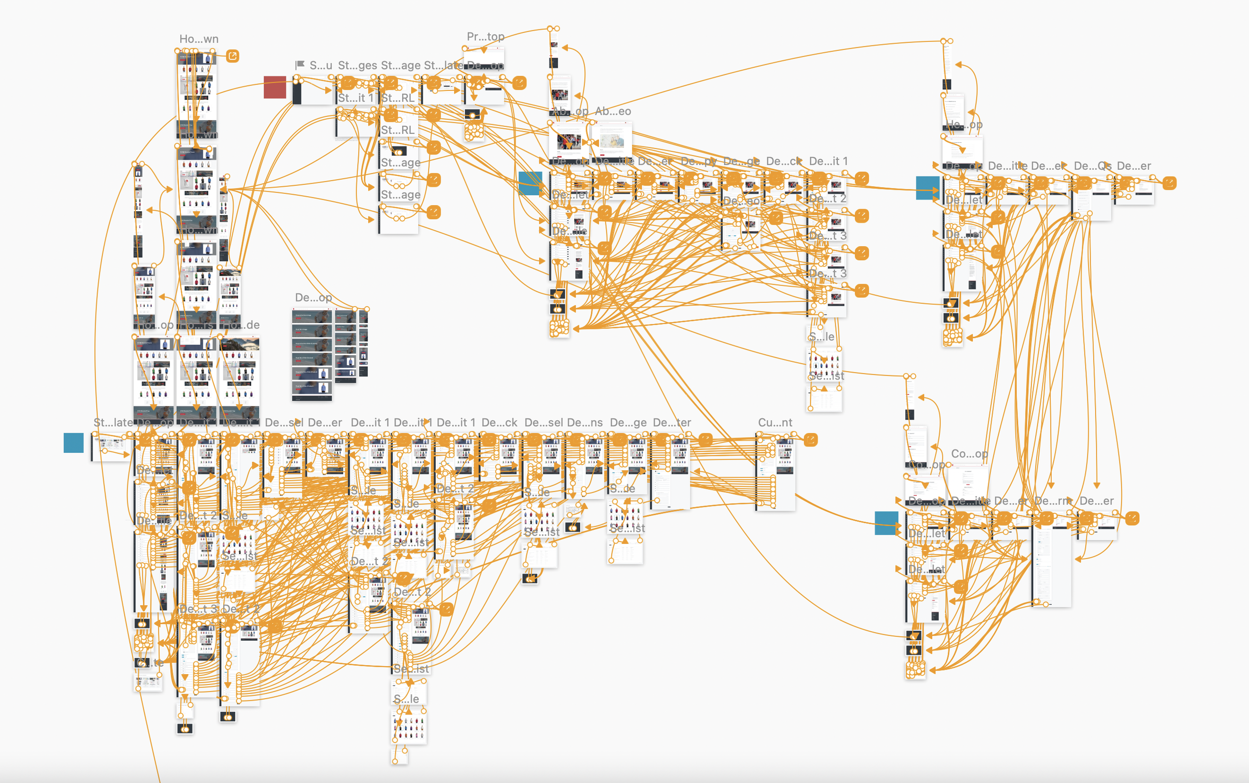
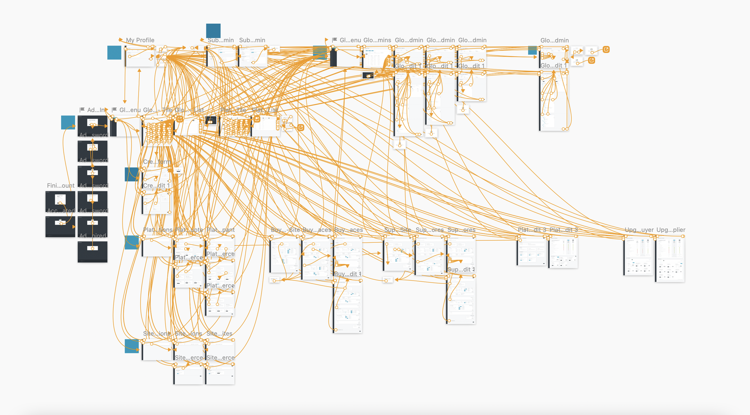
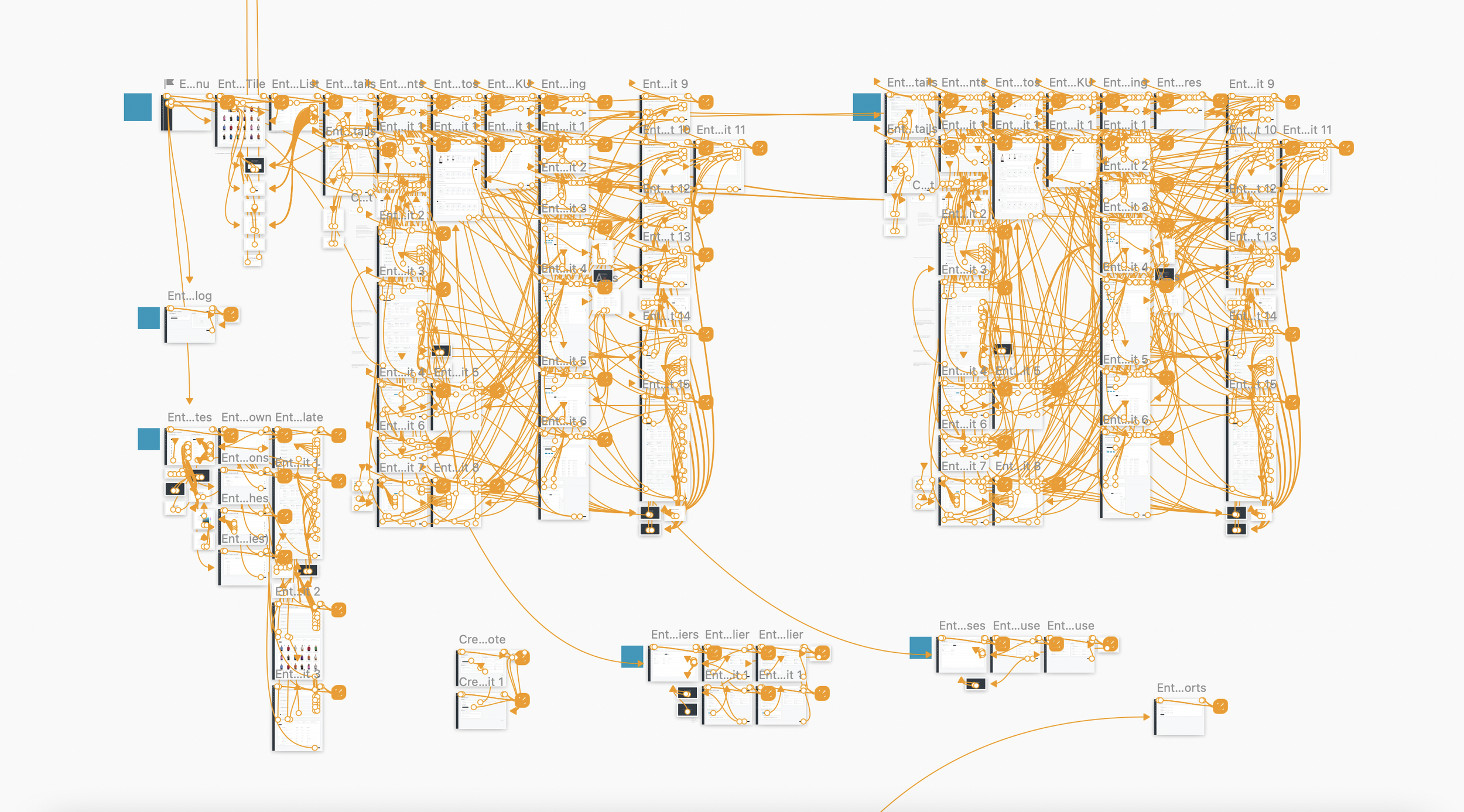
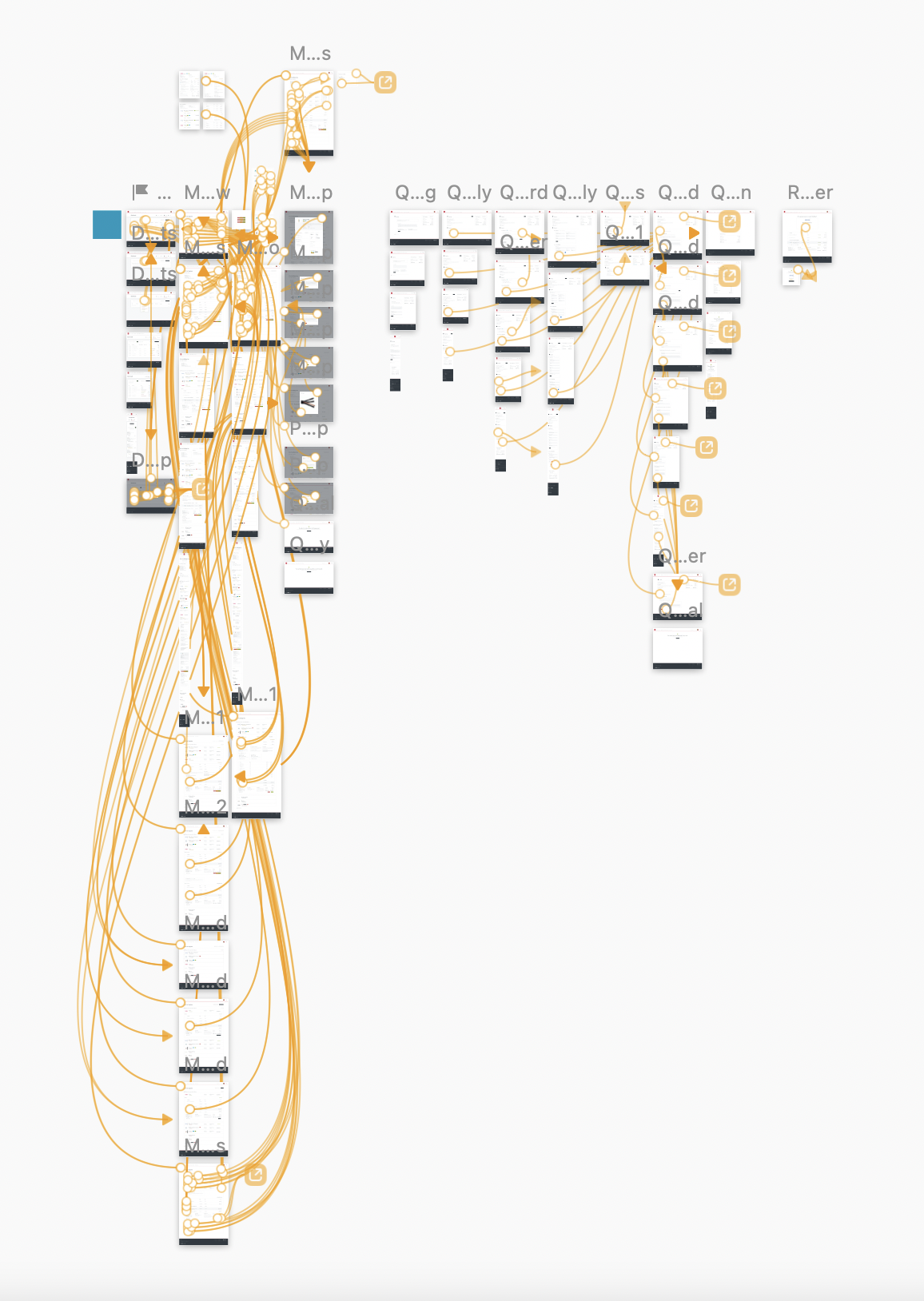
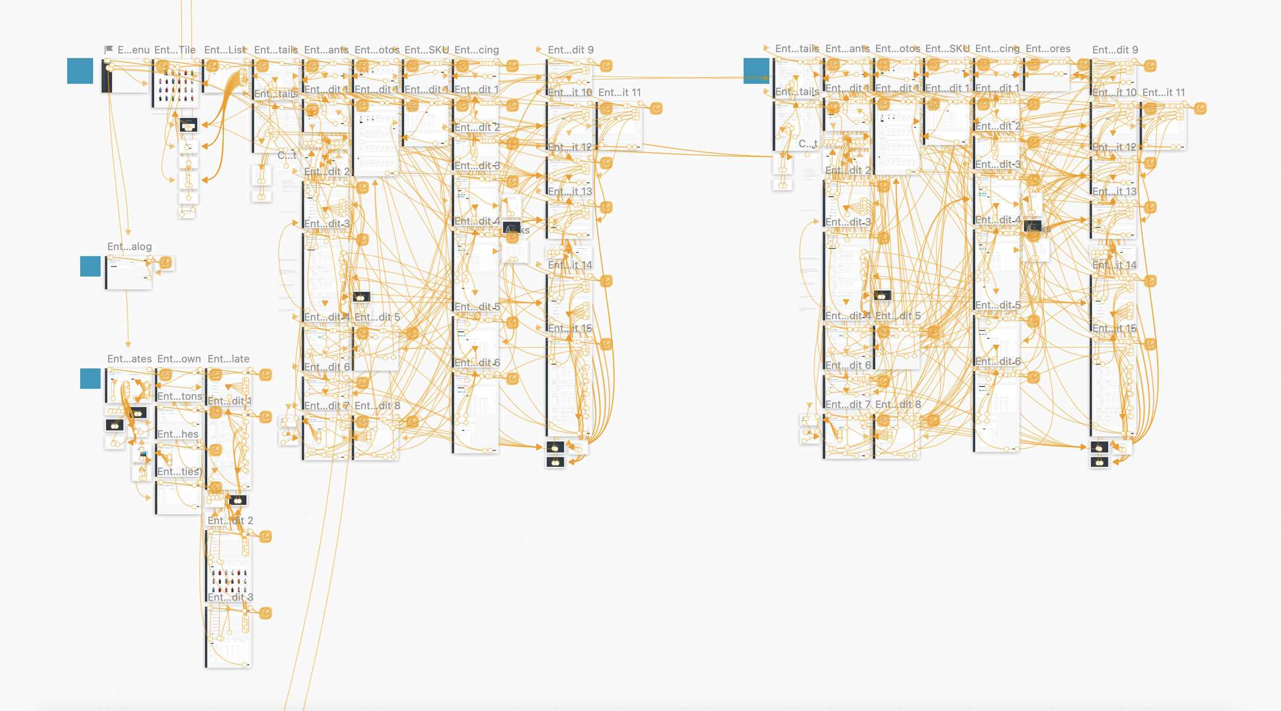
Using Sketch as my primary design tool (supplementing with Figma for specific design challenges), I designed over 1,700 individual high-fidelity mockups for 150 unique admin console and front-end modules. Each module was a completely functional prototype, aiding our internal team during design critique sessions and the development team at handoff.
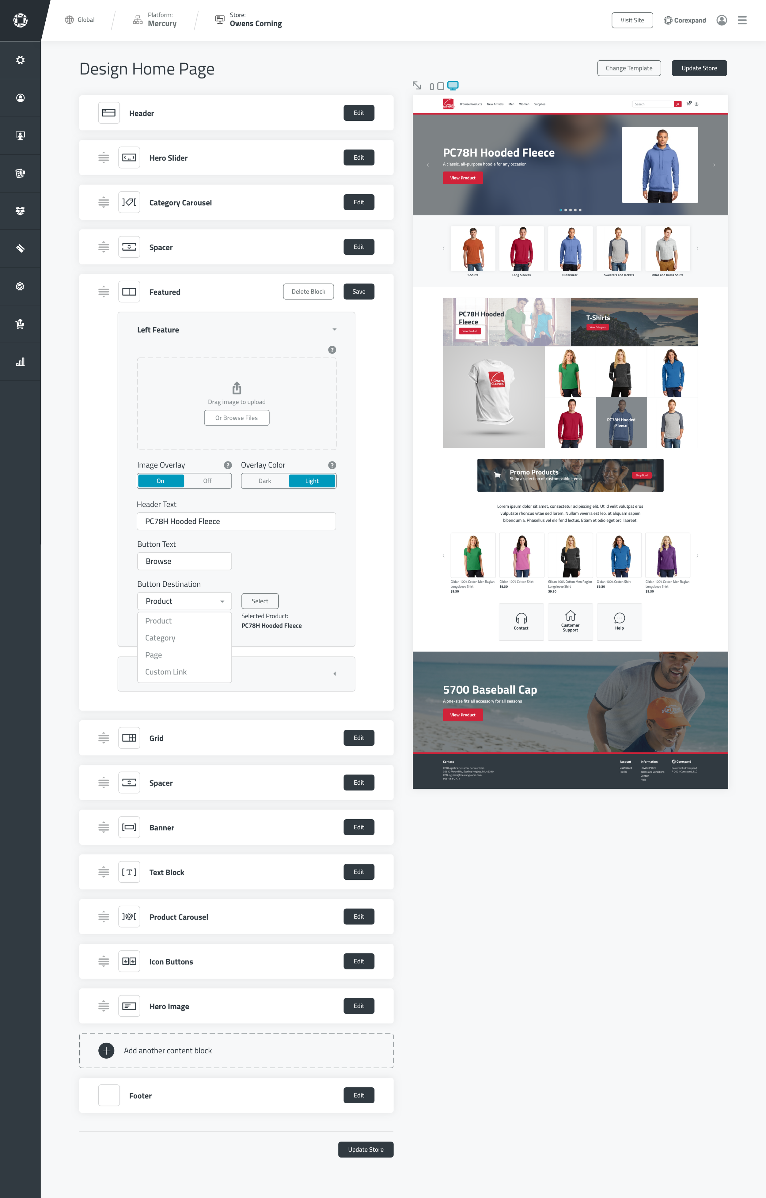
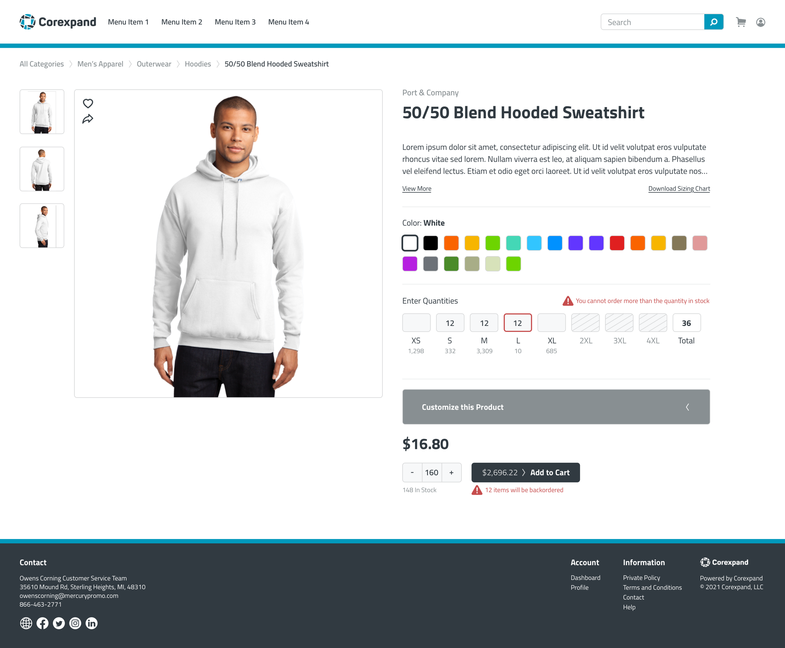
Examples of user interface designs:
Admin Console Site Designer
Front-End Product Page
Admin Console Edit Supplier Page
Front-End Checkout Page
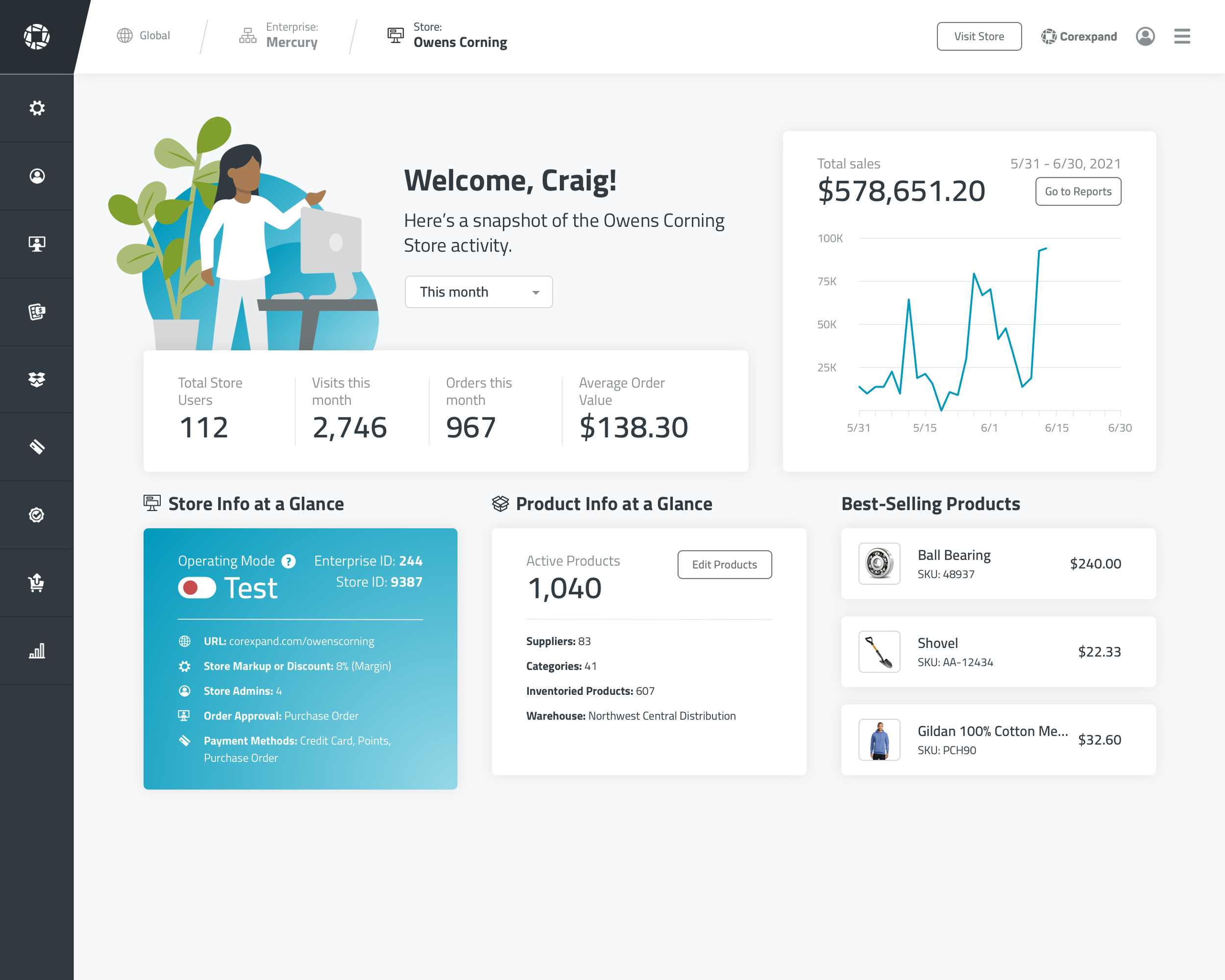
Admin Console Dashboard
Development and Testing
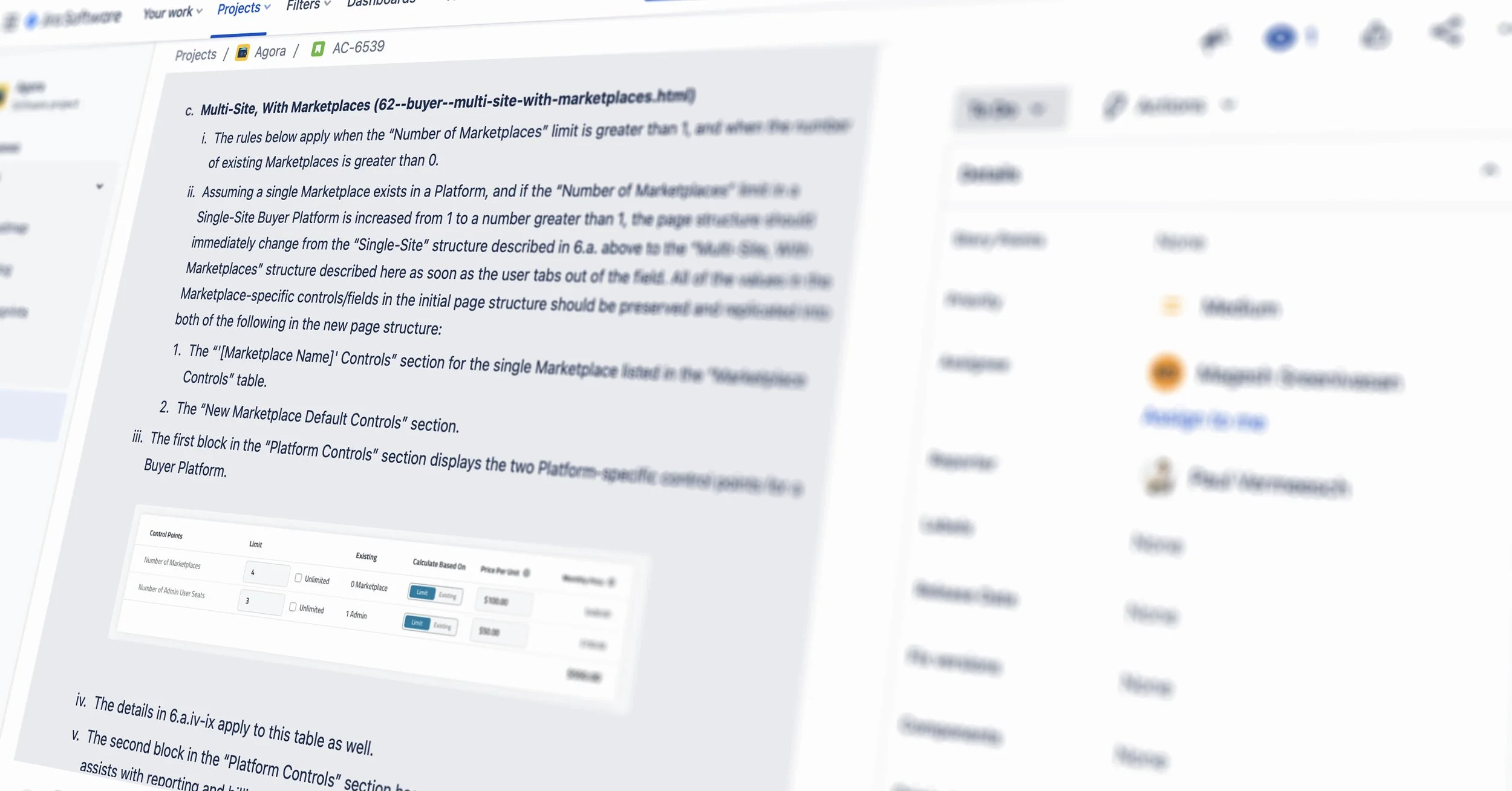
Our development team used an agile approach, working in sprints to build the new tools and modules. In addition to providing our developers with high-fidelity mockups and prototypes, I wrote SRS documents detailing expected behavior, logic, and use cases for each admin console or front-end module. Working with our director of technology, I managed front-end developers and QA testers in Jira. I also served as the final tester in the QA process.
Branding and Identity
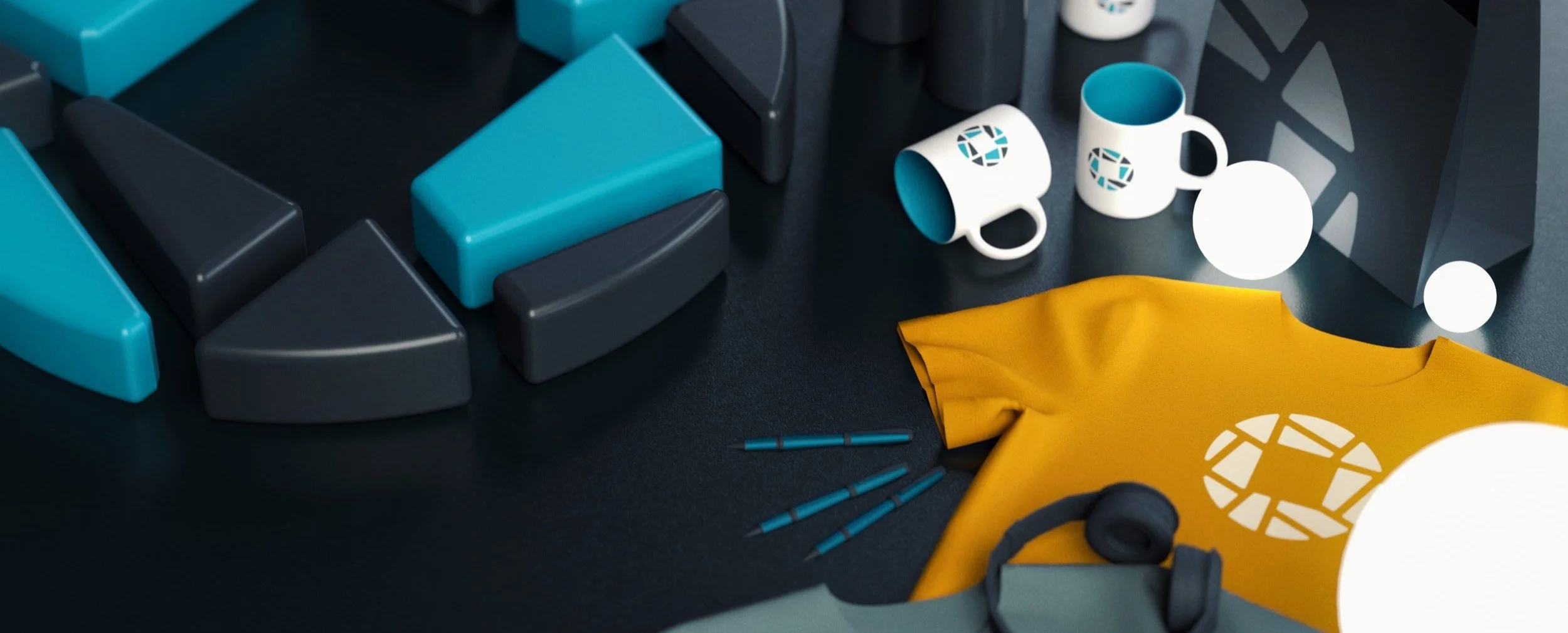
I was responsible for the branding of both the Agora system and the rebranding of its parent company, Corexpand. This involved logo design, color and font selection, illustration, and asset organization.
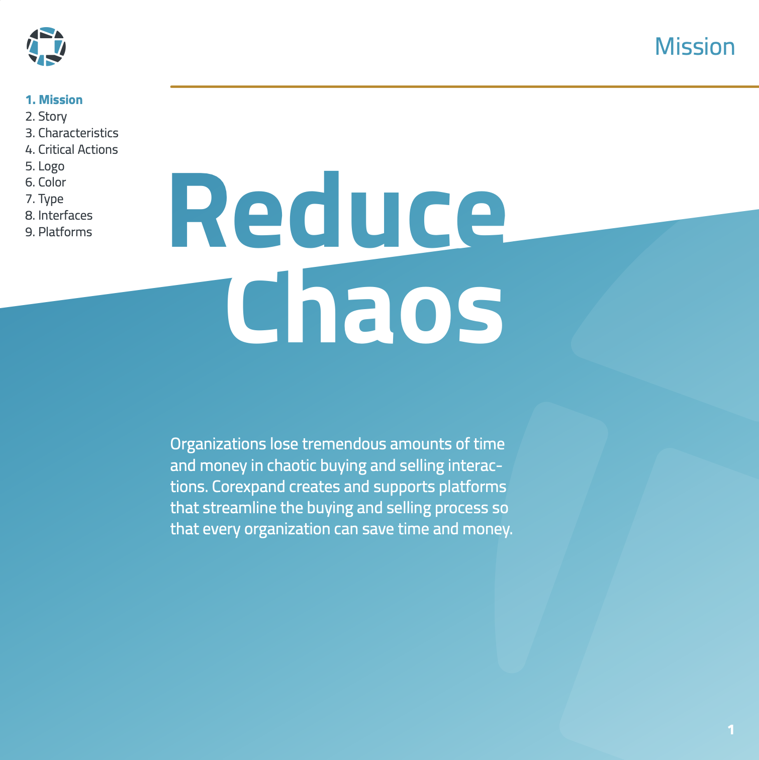
Pages from my Brand Guidelines document:
Original vector illustrations:
Marketing and Sales Resources
In addition to designing the Agora system itself, I also designed sales resources, marketing materials, and marketing sites for the suite of Agora products. I also created a half-dozen promotional and how-to videos for the Agora system. I wrote, shot, performed, edited, motion-designed, and scored videos like the ones below.
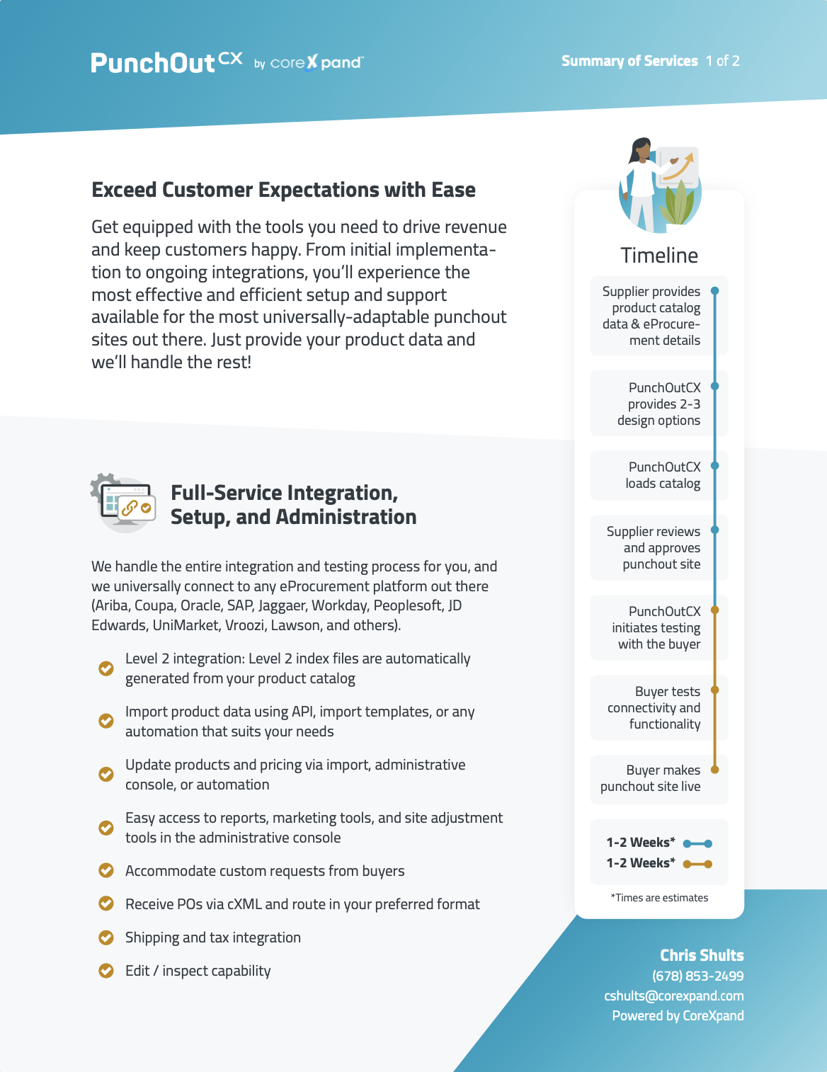
Pages from white papers, leave-behinds, and service summaries that I designed.
Marketing sites for two Agora products:
Conclusion
With its top-to-bottom refresh, the Agora commerce system now better serves buyer and supplier users, giving them greater efficiency, opportunity, and intuitive access to the powerful e-commerce tools developed by Corexpand.
In retrospect, there are parts of the design process I would have likely handled differently. I would have preferred to ground our design decisions more in user research than in internal intuition. I think the use of an existing design system may have accelerated the development of the Agora interfaces. And I think I would have pushed for an even greater reconsideration of the status quo when designing certain modules.
Overall, however, Agora represents a tremendous accomplishment personally and on the part of our hard-working team. I learned a lot from the process and was able to exercise my design and collaboration skills in a cross-functional team to create a remarkable product. I’m proud of the work we accomplished.


