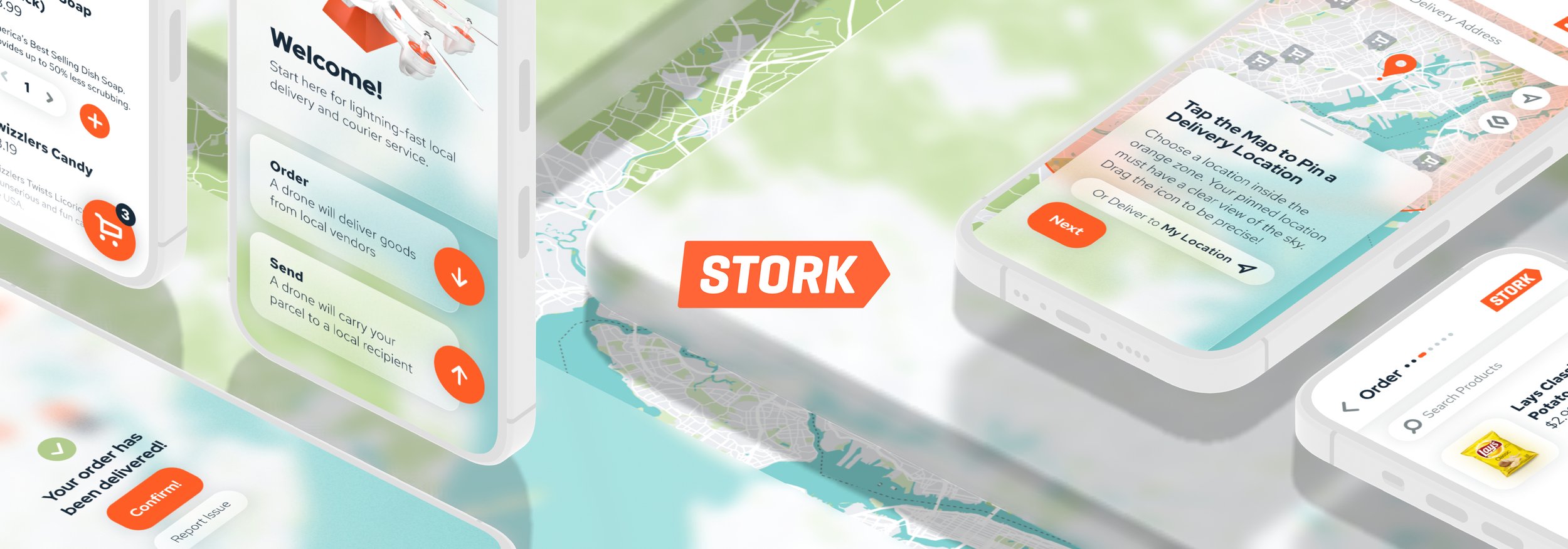
Drone Delivery App UX Design
Stork is a hypothetical drone delivery service that allows users to order items from businesses in their area, track delivery by drone, and send parcels locally. As a UX project, the Stork app presented a compelling design challenge: to create an intuitive, map-based interface with both an e-commerce “order” workflow and a courier service “send” workflow.
Project Duration: 2 Months
Role: Ideation, branding, research, and design by Paul Vermeesch
Problem & Goal
Problem: In an age of free 2-day shipping on a national scale, local shipping and delivery remains comparatively slow, expensive, unreliable, and inefficient.
Goal: Stork will enable users to order items from local vendors and ship parcels to local destinations more quickly, cheaply, and efficiently than standard delivery and shipping methods like Doordash and USPS. The app will remove reliance on street addresses for shipping, providing pinpoint-accurate shipping to and from anywhere.
Competitive Analysis
I began the UX design process by looking at several potential competitors in the drone delivery space. Although the three competitors I analyzed all provide similar services, they lack several features Stork intends to provide. Due to these gaps in the competition’s offerings, Stork captures a competitive edge in the following areas:
A courier service option for local parcel shipment
An option to browse vendors prior to setting a delivery location
An option to ship items directly to the current location of the device
A clean, modern interface and clear progress indicators

User Personas
Creating user personas was a key step in the user-centered design process, as it allowed me to visualize the needs of specific target users. These users’ end goals informed the design process at every step.

Janus
Janus owns a small printing business that does a lot of local business. He’s always looking for new ways to innovate, and he would love to be able to offer an alternative shipping method to deliver rush orders to his local clients.

Sheryl
Sheryl is a working mother of two and often struggles to find time to run her errands without a lot of advance planning. Hesitant to pay for services like Instacart, she would love a more affordable delivery option for essentials.
User Journey and Ideation
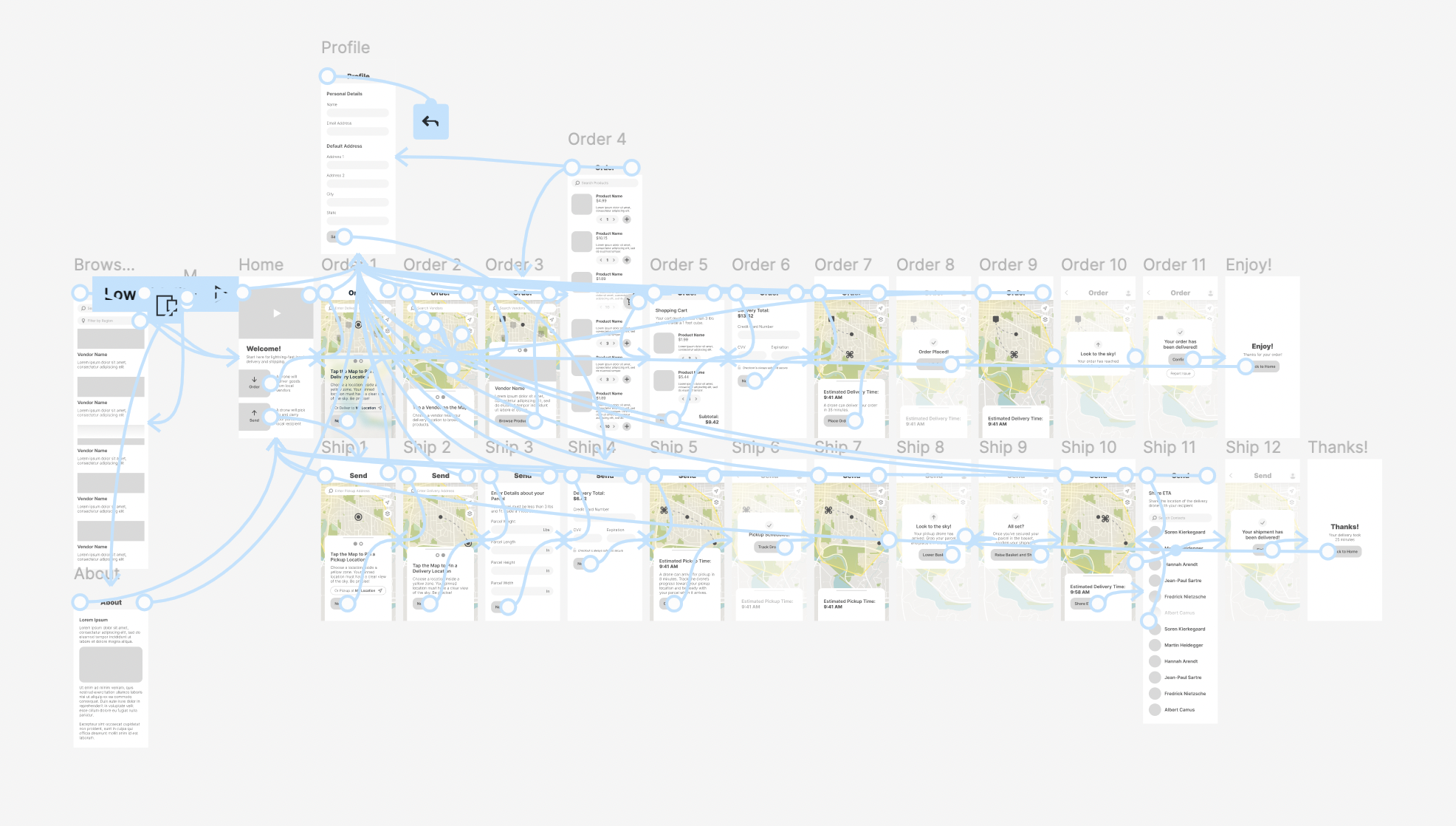
I began ideation for the project by constructing a rough flow representing a user’s start-to-finish journey when ordering or sending a parcel using Stork. This user journey helped guide the initial wireframing process and gave me a clearer picture of the ways users could interact with the product. This also helped me construct the information architecture of the app from the perspective of user goals.


Initial paper wireframes and storyboards
Digital Wireframe and Low-Fidelity Prototype
After sketching initial paper wireframes and working through the preliminary user journey, I began translating the paper wireframes into digital wireframes and building out a low-fidelity working prototype in Figma which I could test in a usability study.

Usability Study
Once the low-fidelity prototype was complete, I conducted a five-person, three-prompt, remote usability study to determine if ordering and shipping items with the Stork app was superior to alternative ordering, delivery, pickup, and shipping options. After conducting the study, I began organizing feedback into an affinity diagram to begin determining research themes.


Research Insights and Design Iteration
After conducting and organizing my usability study research, I extracted several actionable insights and began implementing research-based solutions in the next iteration of the wireframes, and ultimately carried those design changes through to the final high-fidelity mockups.
Research Insight 1
“What does it mean to ‘Ship’ something? The language is kind of vague.”
Insight: While “Ordering” is intuitive, “Shipping” a parcel using the app needs more explanation.
Solution: Add additional text to the “Order” and “Ship” buttons on the home page to clarify what each means.


Research Insight 2
“It's a little weird having to select your delivery location first before the vendors.”
Insight: When placing an order, users want the ability to browse vendors first.
Solution: Create an additional page accessible from the home page of the app to browse all vendors by region without first selecting a delivery location.
Research Insight 3
“I would suggest adding a feature to be able to share my ETA with my recipient.”
Insight: Easy communication with recipients when sending parcels is a priority for users.
Solution: Add a button once a parcel has been shipped to notify the recipient and allow the recipient to track the drone.


Research Insight 4
“It would be helpful to know that that was a secure checkout.”
Insight: The security of personal payment information is important to users.
Solution: Add additional copy to payment pages that indicate the security of the checkout process.
Branding and Design System
As I began to craft the final high-fidelity mockups, I also defined the Stork brand by creating a logo, a color palette, and type guidelines. As I designed components for the interface, I added those to a design system sticker sheet to make UI replication easier. All design elements meet WCAG 2.1 AA accessibility standards.


High-Fidelity Mockups and Prototype
As the final step in the design process, I completed a set of high-fidelity mockups and a polished prototype of the Stork app. At this phase, all assets are ready for development passoff.


